
Bar graph below shows the amount of carbon emissions in different countries during three different years.
Summarise the information by selecting and reporting the main features, and make comparisons where relevant.
Sample Answer
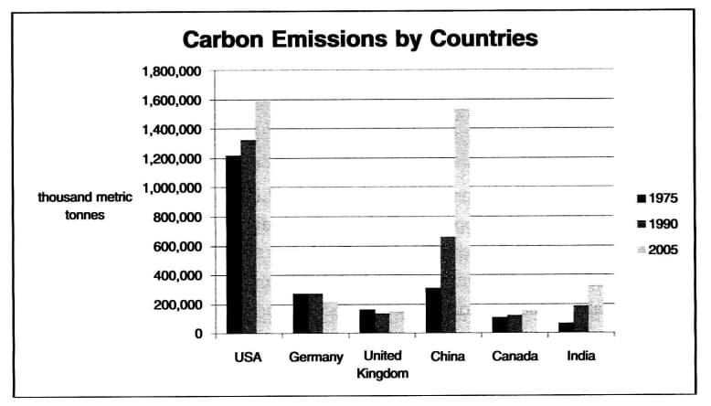
The bar graph shows CO2 emissions for six countries in 1975, 1990, and 2005.
[do_widget id=custom_html-24]
The USA emitted the largest amount of carbon for all three years, showing an increase from slightly over 1,200,000 thousand metric tonnes in 1975 to just under 1,600,000 thousand metric tonnes in 2005. China’s level of carbon emissions more than doubled from 300.000 thousand metric tonnes in 1975 to over 600,000 thousand metric tonnes in 1990 before more than doubling again to approximately 1.6 million thousand metric tonnes in 2005. In contrast, Germany’s carbon emissions reduced slightly from approximately 250,000 in 1975 and 1990 to roughly 200,000 in 2005. The only other country to reduce emissions was the United Kingdom between 1975 (approximately 180,000) and 1990 (about 160,000), although this was relatively slight and rose again in 2005 to 170,000. Canada’s level increased each year slightly to match the UK in 2005, and carbon emissions in India jumped from approximately 80.000 in 1975 to 350,000 in 2005.
[do_widget id=custom_html-25]
On the whole, the two largest contributors to carbon emissions were the USA and China.
Vocabulary
- The bar graph shows
- Emitted
- Showing an increase from slightly over
- More than doubled from
- Reduced slightly
- Roughly
- Rose again
Also check :